01 Nov 2017
Estimate Error in Calibrated Instrument Methods
Many of us produce and report precise quantitative measurements on a daily basis. These measurements are often at trace levels or from highly complex matrices, both of which influence the achievable precision associated with the results generated.
Whilst validation exercises demonstrate an achievable level of method performance, our on-going daily work will be susceptible to variability due to changes in sample matrix, extraction, and instrument conditions. It’s why we run QC checks with each batch of analysis, to ensure that our analysis is performing to the specification determined during instrument validation.
All good to this point?
So when was the last time you reported your results with an estimate of the error associated with the data? You don’t need to because your method is performing within the levels defined by various agencies and which were confirmed by your validation and your daily QC checks. The person for whom you are producing the data is aware of these tolerances and therefore inherently appreciates the associated precision of the data and can make judgements based on this.
Not in the world I work in!
When I began my career the reporting of analytical data with an associated error or data range was absolutely commonplace. Not so these days, and I’m still looking for the reasons why.
Very recently we began to routinely report errors with data produced for certain testing types. This includes instances where the data precision is highly significant, such as clinical measurements, toxicological or pharmaceutical limit tests or where the end user is not aware of the implied precision – i.e. they do not appreciate the precision required by ICH Analytical Procedures and Methods Validation for Drugs and Biologics (July 2015) for example. I can tell you that this approach has, on several occasions, influenced the interpretation of the measurement and the subsequent decisions taken.
I thought it would be useful to show a simple treatment of how we are doing this – in case it may also spur on others to estimate, and perhaps even report, the actual precision of their data.
Our approach is not a highly complex Propagation of Errors calculation, and can only be used when a calibration curve is generated as it is from this curve and the regressions statistics that our calculations are derived. I’ll leave a full treatment of the statistics of regression and error within the Product Moment Correlation (r or r2) statistics to a later article to allow a shorter, more focussed discussion on the error treatment here.
So, here is the calibration data for a determination which is a GC method using an internal standard for a clinical assay at low levels which I’ve entered in Microsoft Excel™
| Nominal Std Concentration (mg/mL) | Peak Area Ratio | |
| 1.04 | 0.412 | |
| 3.08 | 1.366 | |
| 5.56 | 1.879 | |
| 10.12 | 4.888 | |
| 20.45 | 7.767 | |
| 50.66 | 21.346 | |
| Mean | 15.15 | 6.28 |
Table 1: Calibration data for an Internal Standard GC Method.
You will need to have the Analysis Toolpak installed into your version of Excel – the help files within the program take you through a step by step guide on how to do this and it takes around 30 seconds.
The actual statistical tests will appear in the ‘Data’ toolbar under ‘Data Analysis'

Figure 1: Where to find your Statistical Analysis tests in Microsoft Excel™.
Select ‘Regression’ from the Data Analysis check box list and then complete the inputs on the pop out window as shown in Figure 2.
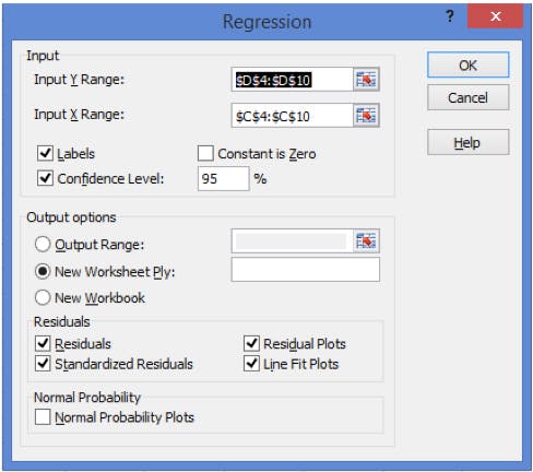
Figure 2: Requirements for the Regression Options form (note: include the title of each data set in the Input Ranges).
Ultimately you will be presented with a separate spreadsheet tab containing your regression analysis data, which with only a small amount of resizing of windows will give you the following information;
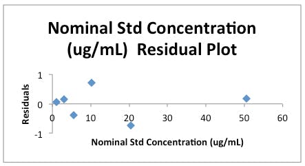
Figure 3a: Residuals Plot for the data in Table 1.
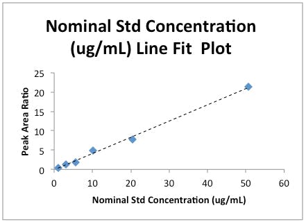
Figure 3b: Linear Regression plot for the data in Table 1.
Note that I’ve added a Trendline to the Line Fit plot and removed the ‘Predicted’ data series values. Both of these are accomplished by right clicking on any data point and following the obvious choices on the popup menu.
Two things are accomplished here.
Firstly, you will no doubt have been told many times to plot calibration data with a regression line to visually confirm that the data ‘looks linear’ and that the regression co-efficient obtained from the Product Moment Correlation is not hiding something (i.e. the data doesn’t look skewed).
Secondly, we obtain a plot of the residuals for each data point. The ‘residual’ is simply a quantitative measure of how far the actual instrument response (y) is away from the predicted value at each measured concentration (x) obtained using the regression equation from the regression analysis. A measure of ‘goodness of fit’ for each of our calibration points if you like. The plot should show random scatter about the ‘0’ line, any gross outliers should be examined and a run of more than three points in the positive or negative direction is worth investigating in terms of the possibility of ‘bias’ at those concentration levels – especially when they occur as the highest or lowest concentrations in the calibration range.
For our data the Regression Output which defines our linear regression equation in the form is highlighted in Figure 4.
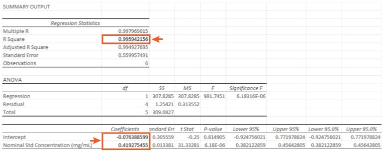
So in the form;
 (equation 1)
Our actual regression data would be;
 (equation 2)
with a regression co-efficient (R Square) value of 0.9959
WARNING: SCARY STATISTICAL EQUATION!
 (equation 3)
|
|
|
is the residual standard deviation |
|
|
|
is the number of paired calibration points (xi,yi) |
|
|
|
is the calculated best-fit gradient of the calibration curve |
|
|
|
is the mean of N repeat measurements of y for the sample |
|
|
|
is the mean of the y values for the calibration standards |
|
|
|
is a value on the x-axis |
|
|
|
is the mean of the xi values |
Equation 3 shows the formula for determining the standard deviation in the measurement of an interpolated value of Y using Equation 2 and at this point we lose most people.
But please stick with us, because the calculation of the result of an unknown determination and the associated error is really very straightforward, once you know where to get the numbers.
We have an excel template into which we plug the figures and the results fall out of the other end…
For the sample solution we obtained a measured peak area ratio of 3.647 (yo)
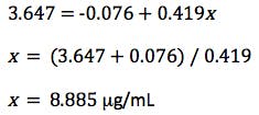
However, as the clinical therapeutic limit for this test is 10 mg/mL I wanted to give an estimate of the error associated with this result. This is easy to estimate using Equation 3 and I’ve indicated how derive the terms of the equation from the regression output and a simple Excel calculation in the treatment below;
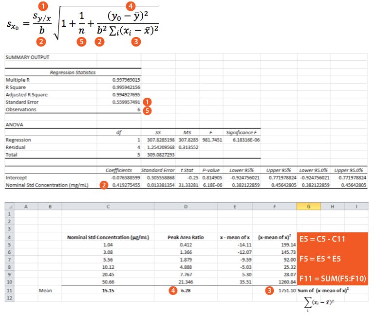
So substituting all of the above values gives us;


Finally we multiply SXo by the t-test statistic for n-2 degrees of freedom at the 95% level of confidence, where n is the number of calibration points we have. We use n-2 degrees of freedom because if we had only 2 points then only one straight line could be drawn, in our case where we have 6 calibration points, the other 4 points are what allows us to estimate the variability. Obviously the number chosen here will depend upon the number of calibration points one uses. I’ve given a small range of t-table values at 95% confidence for a range of degrees of freedom in Table 2. I’ve started at 4 degrees of freedom because to have enough statistical power in the estimation of error one should use at least 6 calibration points.
| Degrees of Freedom | t-statistic at the 95% confidence level |
| 4 5 6 7 8 9 10 |
2.78 2.57 2.45 2.36 2.31 2.26 2.23 |
So – our confidence intervals can be expressed as;
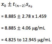
So at the 95% confidence level, we cannot be sure that the result is either above or below the critical therapeutic level of 10 mg/mL, and therefore we are unable to make a clinical decision.
The magnitude of the error associated with this measurement may be surprisingly high to some readers given the ‘goodness of fit’ of the regression line, but for those of who wish to understand this further – examine the y residuals calculated in the regression statistics (C25 to C30 on the results sheet) and the residuals plot, to see that the calibration data shows significant spread about the regression line and it is this spread, and not the linearity of the regression line, which is used to estimate the error within any value interpolated from the calibration line.
A simple way to significantly reduce the error associated with the experiment is to increase the number of replicate determinations made on the sample and use Equation 4 in the calculation.
 (equation 4)
where m is the number of replicate sample determinations.
So if we had made 3 determinations of the sample and used the mean of these as yo then the error would have reduced to ± 2.69 mg/mL or if the number of calibration points (n) were increased to 10 then the error would be ± 2.08 mg/mL as n would increase and the t-statistic used would be that for 8 degrees of freedom (2.31). You should also appreciate that the closer the measured value of yo to ȳ the smaller the value of SXo and this is why we strive to produce a calibration range in which the sample response will fall somewhere close to the middle value.
The exercise here is to highlight the ease with which instrument error in our data can be estimated when using methods involving linear regression and the importance, under certain circumstances, of our clients (internal or external) AND OURSELVES being aware of the true precision of our data.
Of course the treatment above ONLY estimates the error due to the instrument method.
To demonstrate how to assess variability due to sample preparation I’ll need a whole new blog entry!


